Solution at a glance
Craft CMS for flexible and growing content autonomy
Setting the scene

Concept
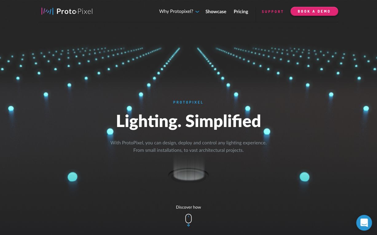
ProtoPixel came to us with the idea of the marble run, leading the user through a series of lighting experiences. So, we began sketching ways in which we could turn this idea into a reality.

Bringing the idea to life
The resulting visuals were seriously impactful. Full of colour, energy and vibrancy they successfully depicted the brand's playful nature and promoted the ease of use that was at the heart of the product design.
Custom vibrant iconography
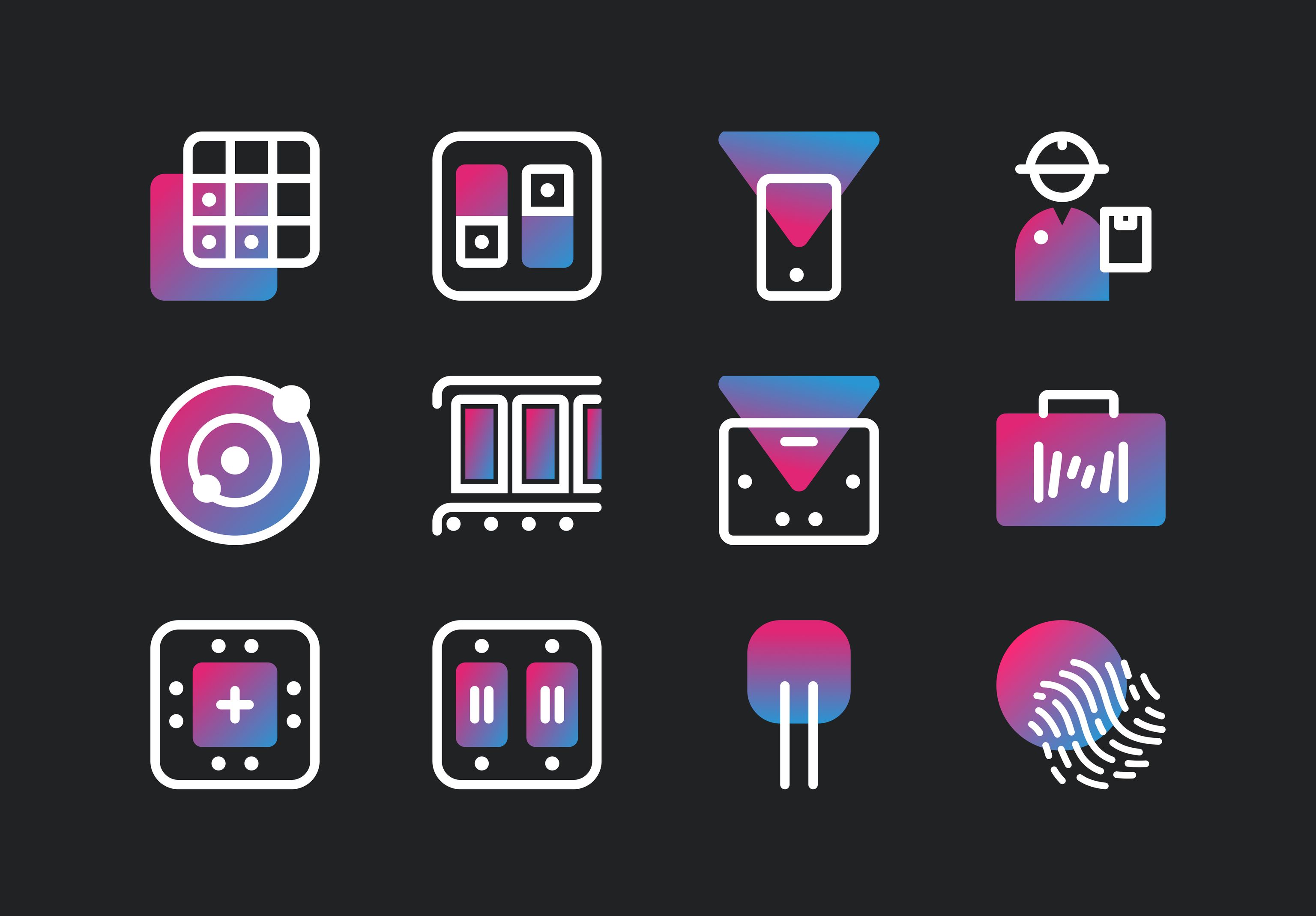
Diving into the product

Flexible landing pages
We provided the client with page builder functionality in the CMS so they'll always have the flexibility to build their landing pages as they choose. We also gave them templated blocks such as testimonials, showcase videos and annotated visuals, to enhance the site and give their customers a detailed and well-rounded view of this revolutionary product.
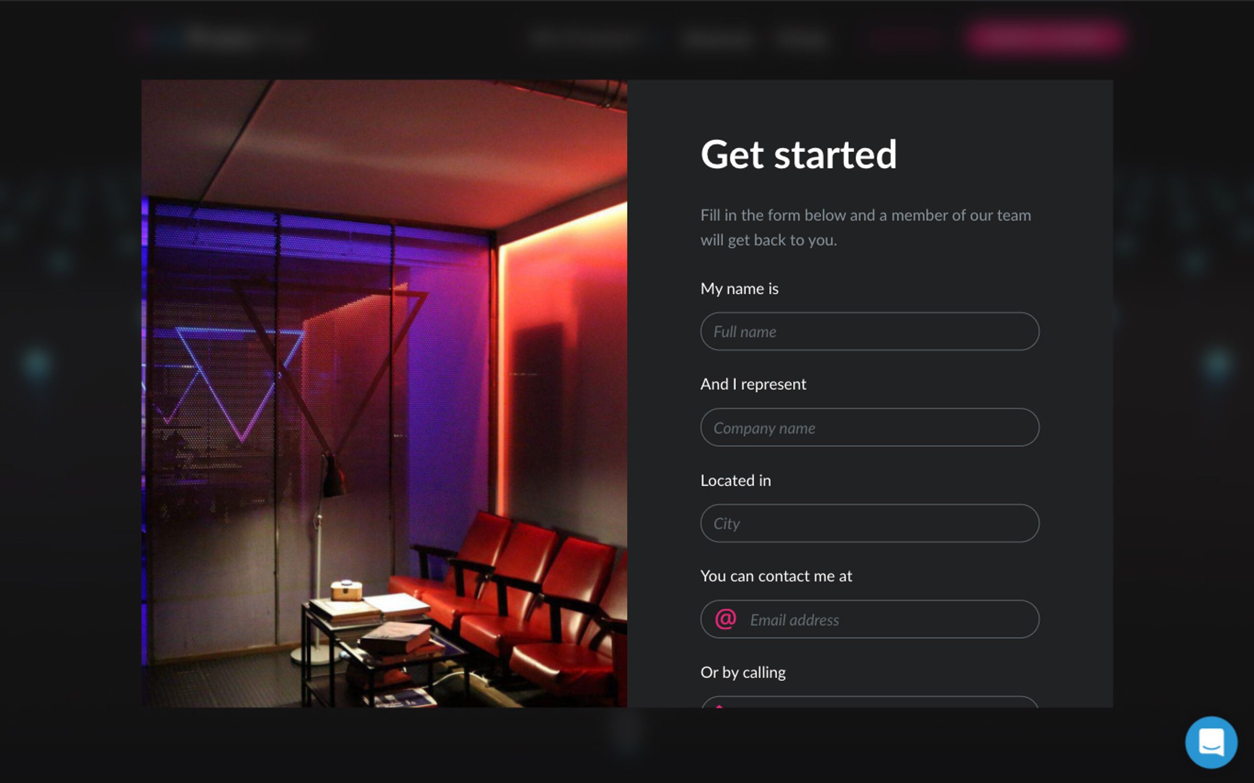
Form builder
We also gave ProtoPixel the ability to build form overlays that were hooked up with their CRM, Pipedrive. These form overlays needed to be just as aesthetically pleasing as the rest of the site, so we presented them with the impactful imagery to fulfil the brief.
Use of animation for increased engagement
Simplified product visuals
To demonstrate the product's capabilities we needed a way to display aspects of the user interface without added complexity. To do this, we created many short looping animations depicting key aspects of the various applications.
Keeping explanation of features simple
We were very selective when picking the most important features to display and how to represent them. This one, for example, summarises a core feature of the Mobile app: Rules.

