Solution at a glance
Bespoke Craft CMS website with custom rental booking interface
User experience and strategy
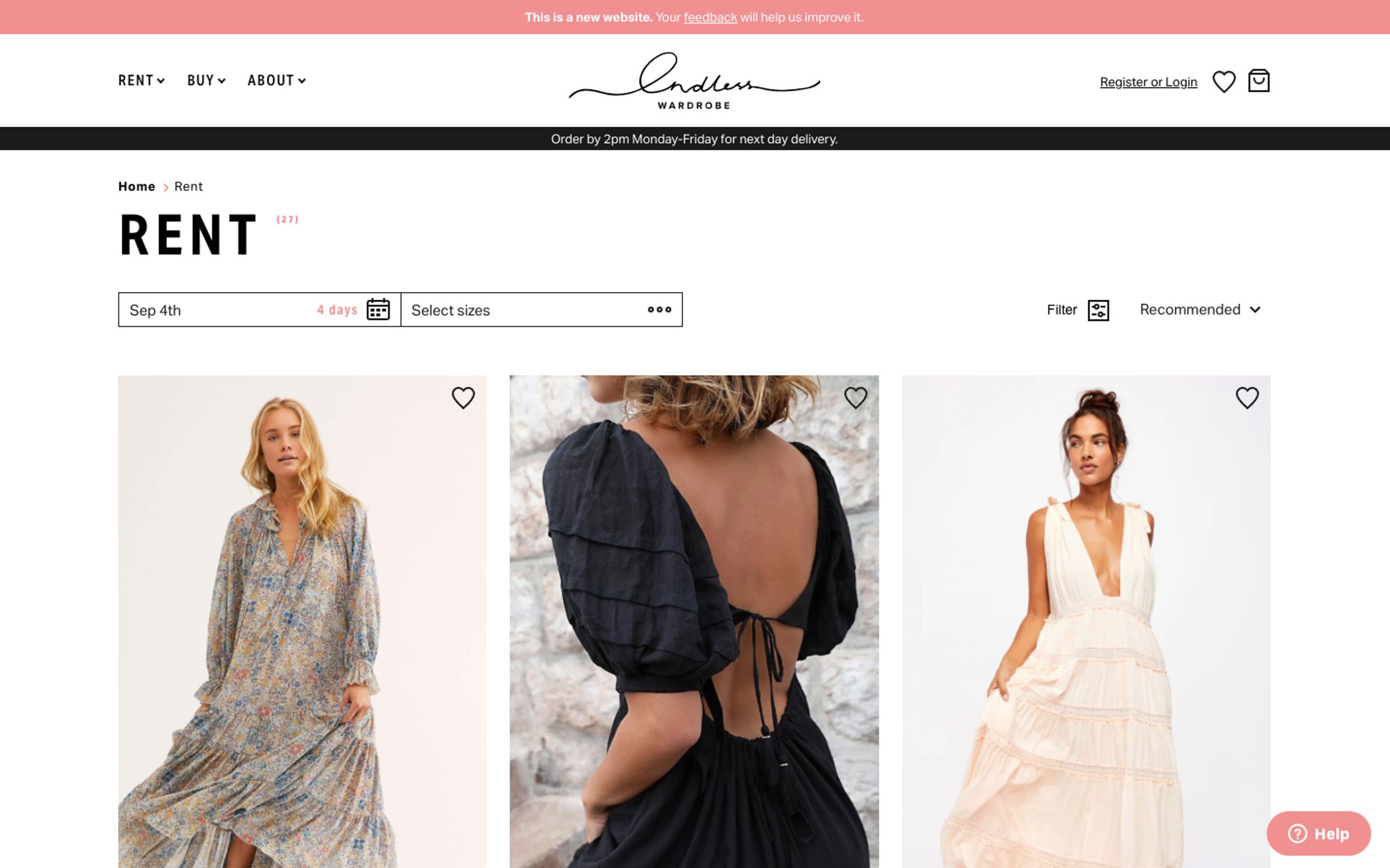
Rental first as the primary funnel to capture interest, but provide the alternative, buying, as a constant (but subtly articulated) upsell presence. This meant that users looking to rent a product for a particular event or occasion could purchase the item if they fell for it (the other way around being less likely). With this strategy in place, we got to work designing an incredibly simple calendar filtering system that brought up the products available based on the user's occasion dates and various preferences.

The calendar experience was designed to combine a start date with a fixed rental duration. This complemented Endless Wardrobe's unique business model, whereby rental durations are specific to payment terms and re-stocking logic. While simple to use and beautiful to look at, the calendar function was complex to code and had to include availability logic in the back end, including blackout days and return availability offsets based on despatch times.
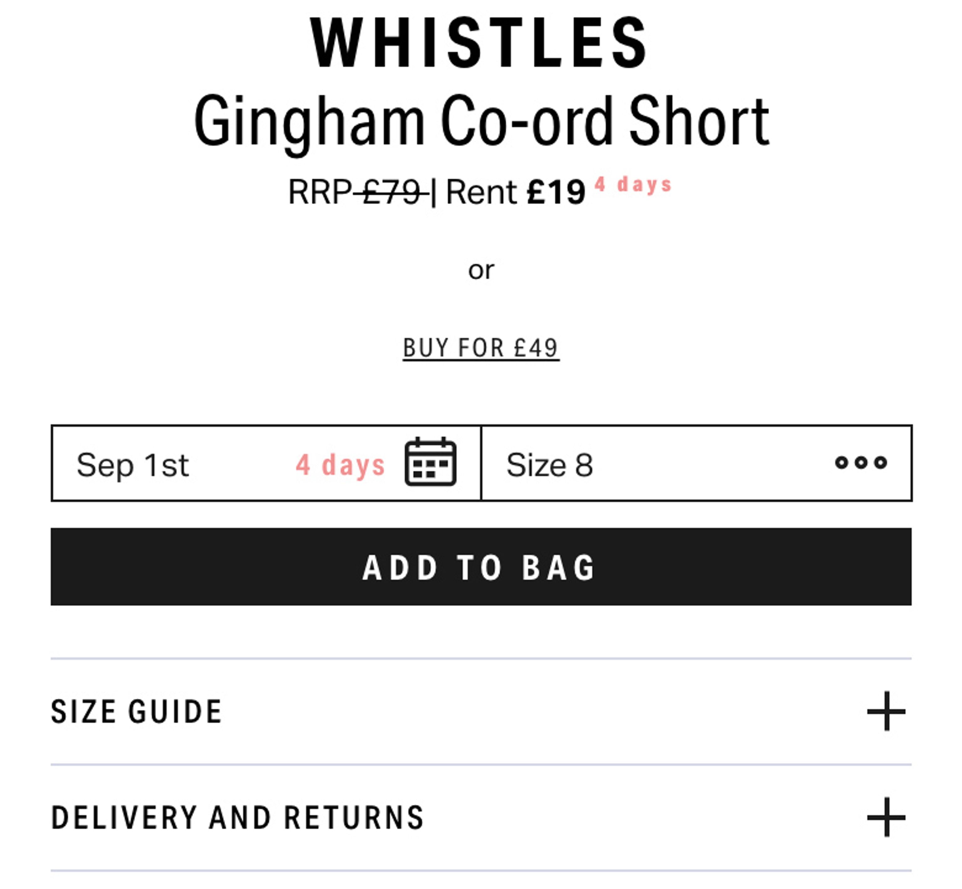
Product descriptions to promote rentals, while tempting you to buy. Underneath the rental features shows a smaller call to action, switches the page to buy mode and displays both the buy new and buy good as new options.
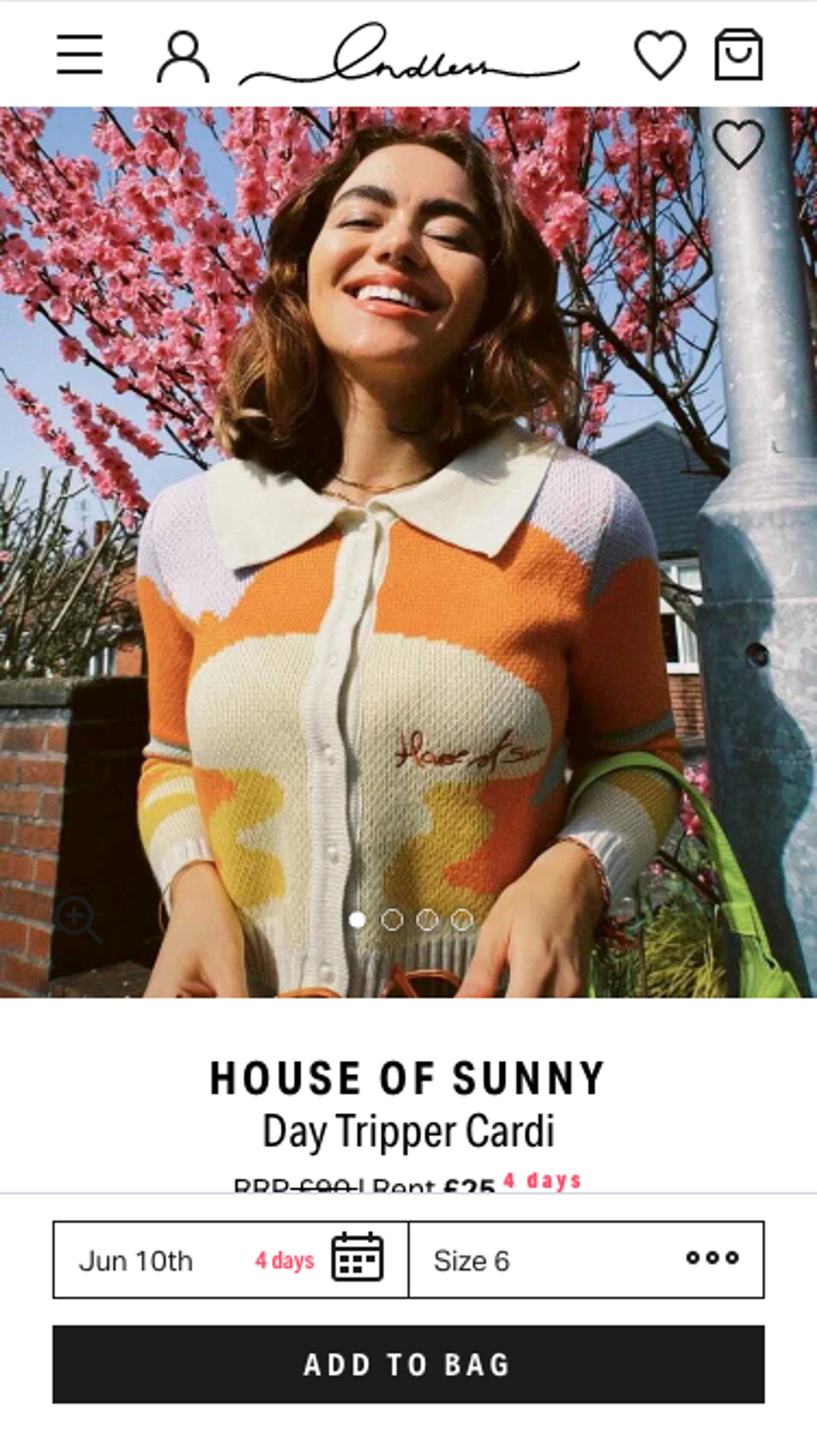
An accessible date and duration picker, optimised for mobile, with an add to cart call to action, made it much easier for users to head to checkout on the go.
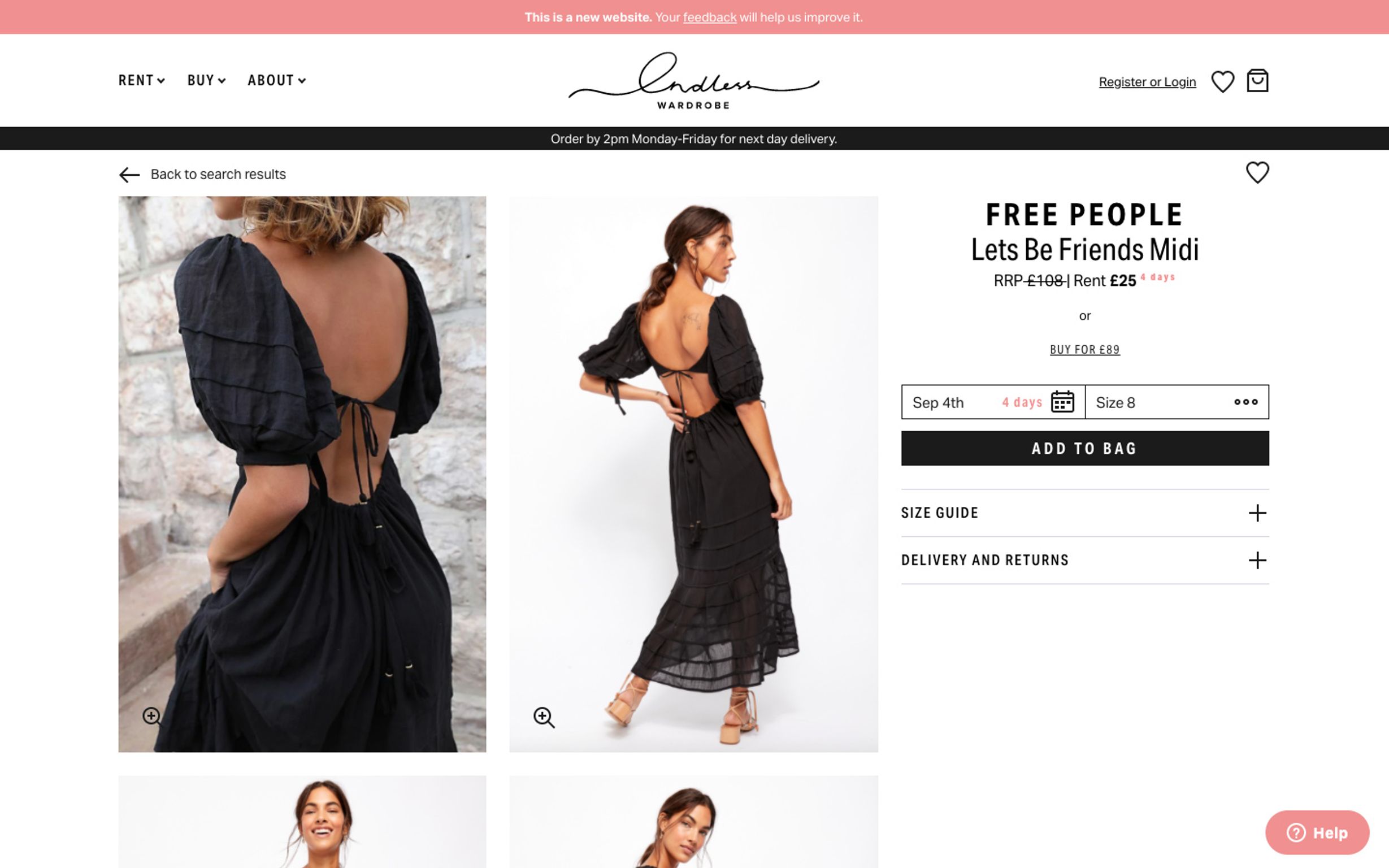
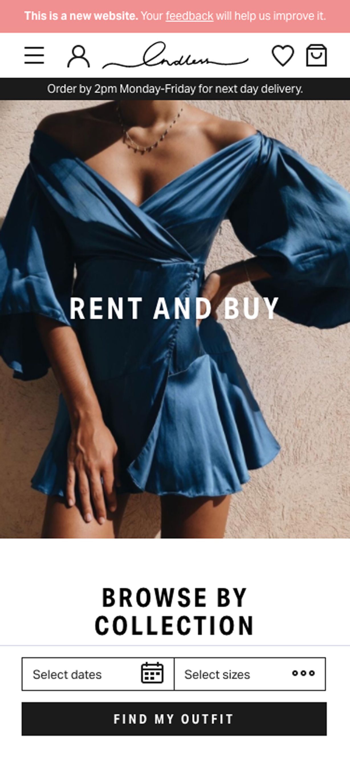
Prioritising mobile devices, but just as beautiful for desktop. Endless Wardrobe's target market is women in their 20s and early 30s. Which we know means they'll likely be browsing on the go, on their mobiles. So 70% of our creative efforts were focused on how the site worked on mobile devices. We utilised sticky footers, clever popup interactions and contextual information to make it as easy and enjoyable as possible on a smaller screen. However, that doesn't mean we left desktop devices to fall behind. Quite the opposite. Once a mobile UX was established we got to work adapting it for desktop devices too, making use of the bigger screen sizes to enhance selling opportunities where possible.
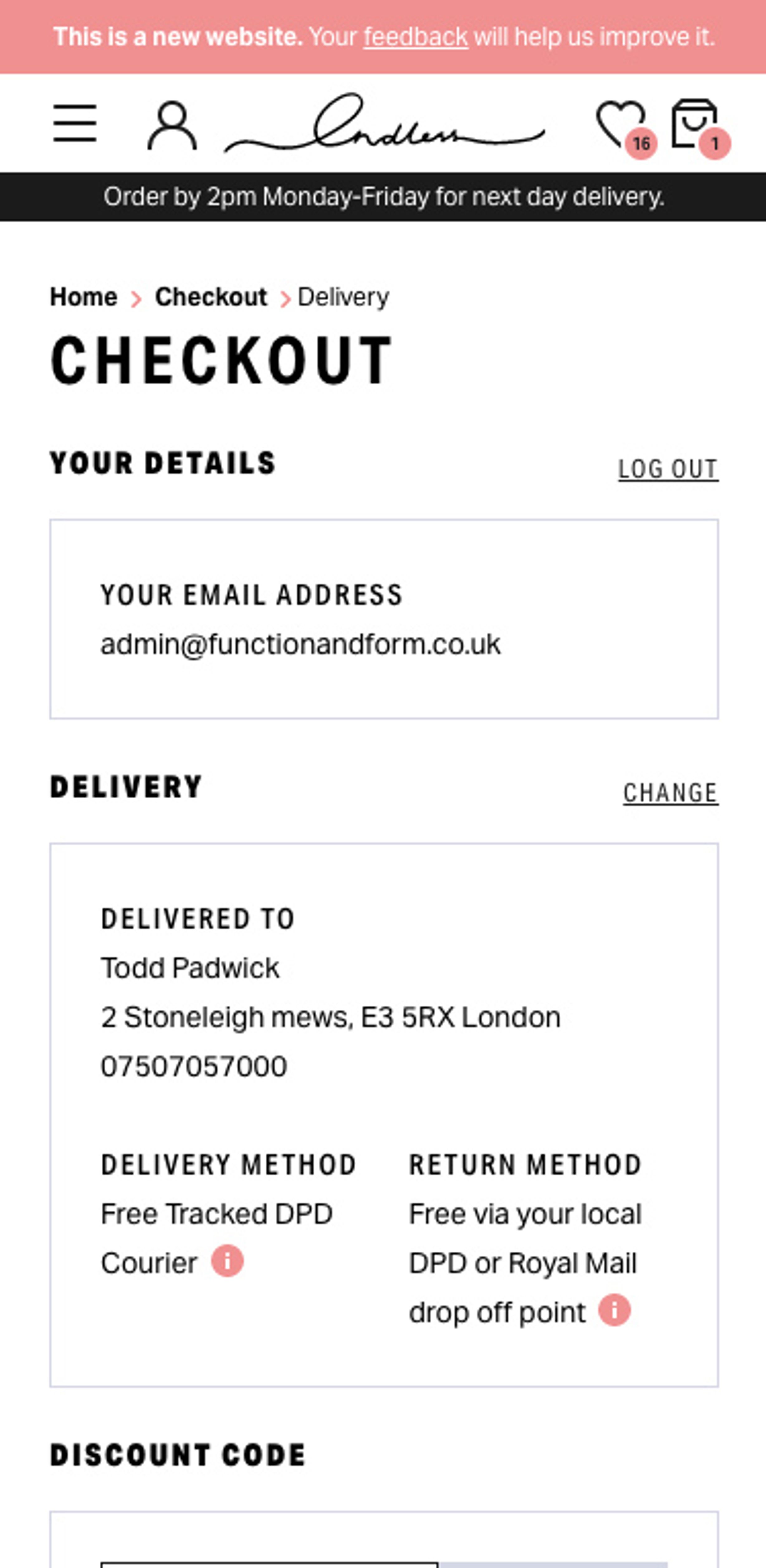
Single page Checkout that is fast, easy and efficient, with Google Pay and Apple Pay options on enabled devices.

Mega-menu navigation to contextualise and make browsing as easy as possible. We also presented adjacent promotional banners to cross-sell without inhibiting the user experience.
