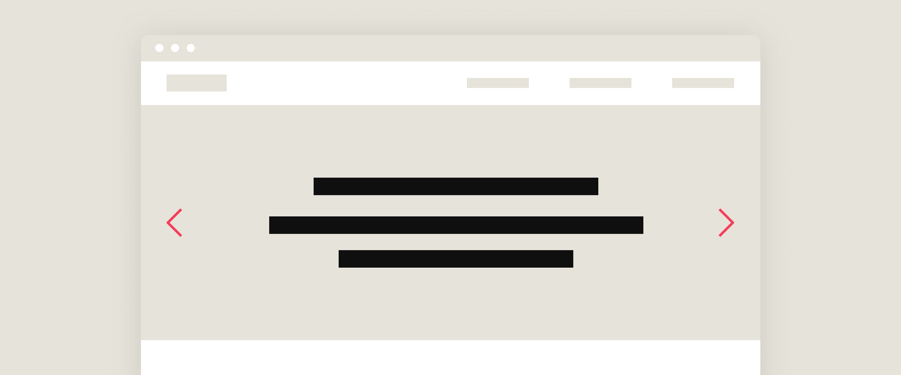
What's the problem?
Don't get me wrong, I'll admit that there are some cases where a homepage slider or carousel may be a good choice. But problems arise when a generic slider has been thrown into the position of landing page hero with limited thought given to the content.
Most web designers at some stage (including a younger me) have designed a homepage concept with a stock image dropped into a hero slider, and dummy text in it’s caption. But one of the benefits of ageing is acquiring wisdom, and I've since learnt that this approach may lead to a number of issues.
So when clients request a hero slider in their homepage, I'm likely to come back with the following:
1. They lack focus
The first section of the homepage is a crucial piece of real estate. Or for the readers out there, it's the all-important book cover (which let's face it, we do judge).
The main goal of the homepage is to instantly capture the imagination of the user and engage them immediately. Which is why a generic slider just doesn't work, it leaves such an important region of the site to someone who isn’t a designer.
2. Promotional content is often more effective when presented a little later in a user's experience
We want your website to create a positive rapport with its audience by providing them with the content they are looking for. Then, once they have found this and are feeling positive, we can cross sell.
3. The ability to upload an infinite amount of content into one space can inhibit creative selection
Less is more. It's a cliché because it's true. If you are limited to one visual for your hero, then you need to make damn sure it’s a good one.
Suggested alternatives
There are many effective ways to utilise the hero space on a landing page. But here are a few we especially like.
Entice the user to scroll down using dynamic and intriguing imagery
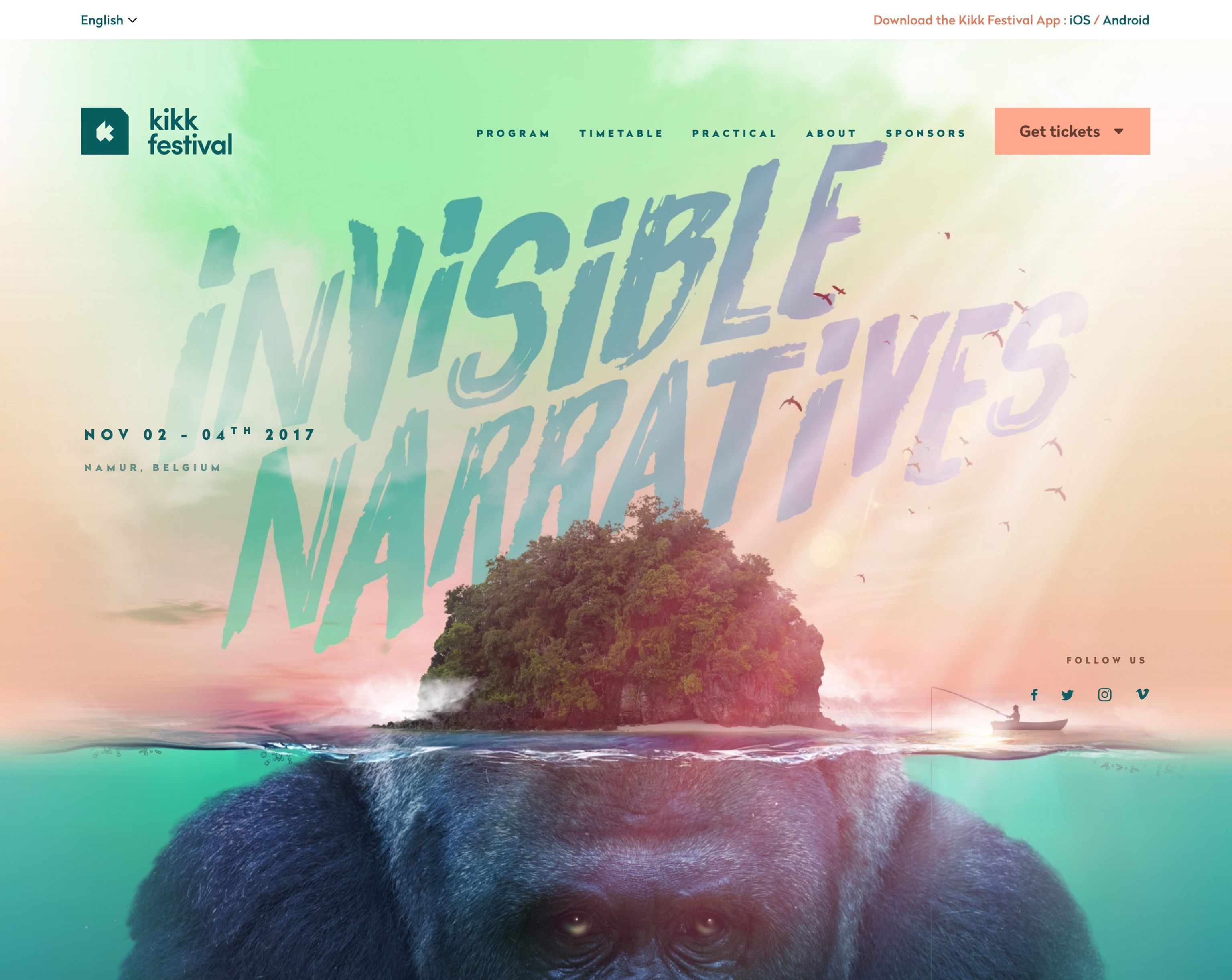
Consider investing in creative visuals to capture your users' imaginations. We love this visual for Kikk Festival. I challenge anyone to not want to scroll down to see more.

Kkik Festival landing page
Present your USP immediately and hook them in with a strong call to action
Use illustration or photography combined with well written copy to portray your USP. You can provide the user with a tempting call to action to tempt them further before they even have to scroll.

Intercoe homepage
Intercom does this very well using friendly illustrations, short headings and an instant call to action.
Abolish the 'hero' altogether
The fold is dead and has been for years. If you don't believe me, have a read of this article from 2011 and this article from 2015.
Actually, maybe that's a little strong. I don't always agree that the fold is dead. But I prefer to refer to it now as the 'hero' or 'cover'. And leading with something engaging here is so important. But it doesn't necessarily need to be contained within the 'fold'.

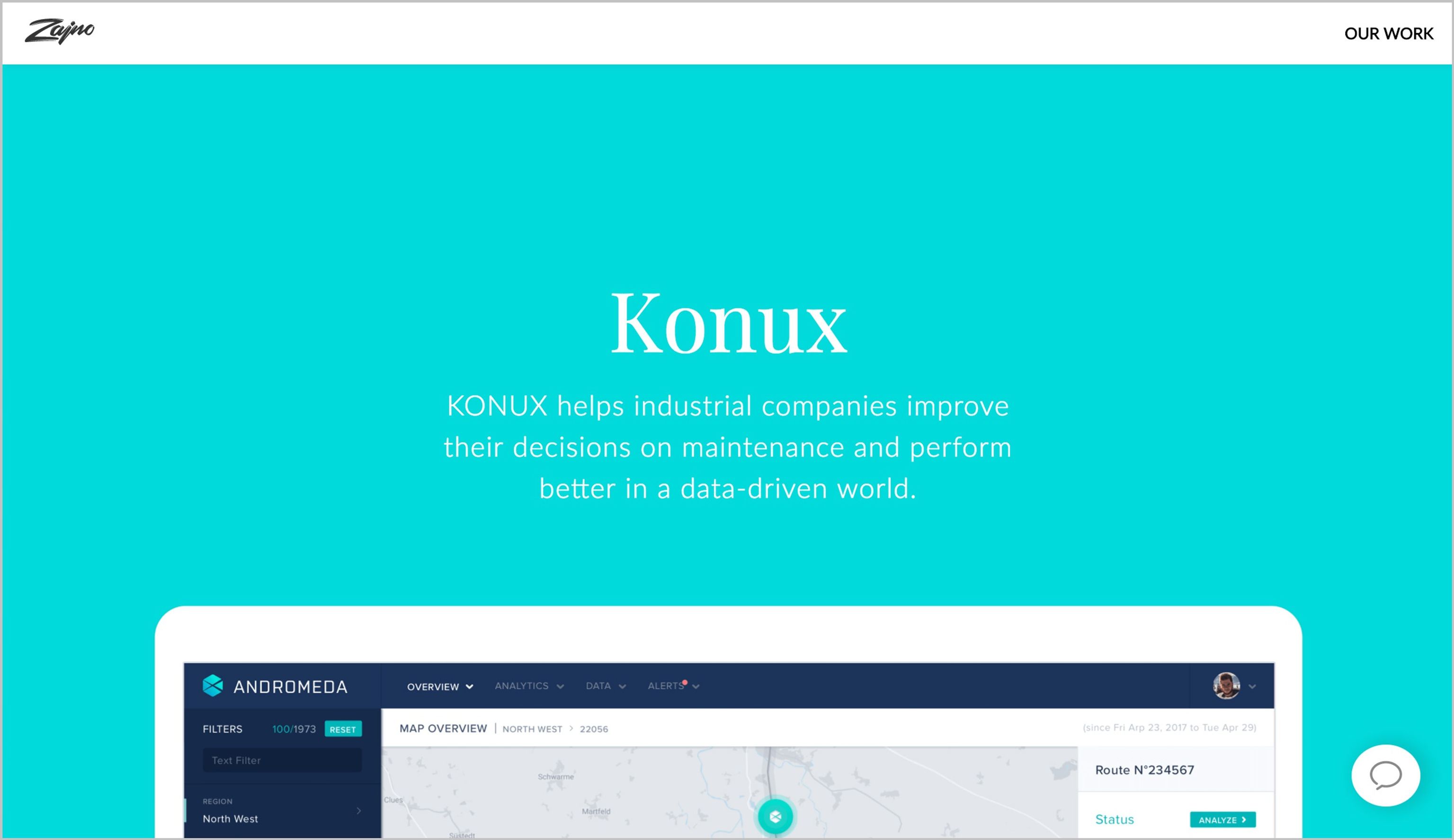
Zajno Homepage
Lead with an introduction and then tempt your uses to scroll further by showing content peaking 'above the fold'.
Begin with something fun for the user to interact with
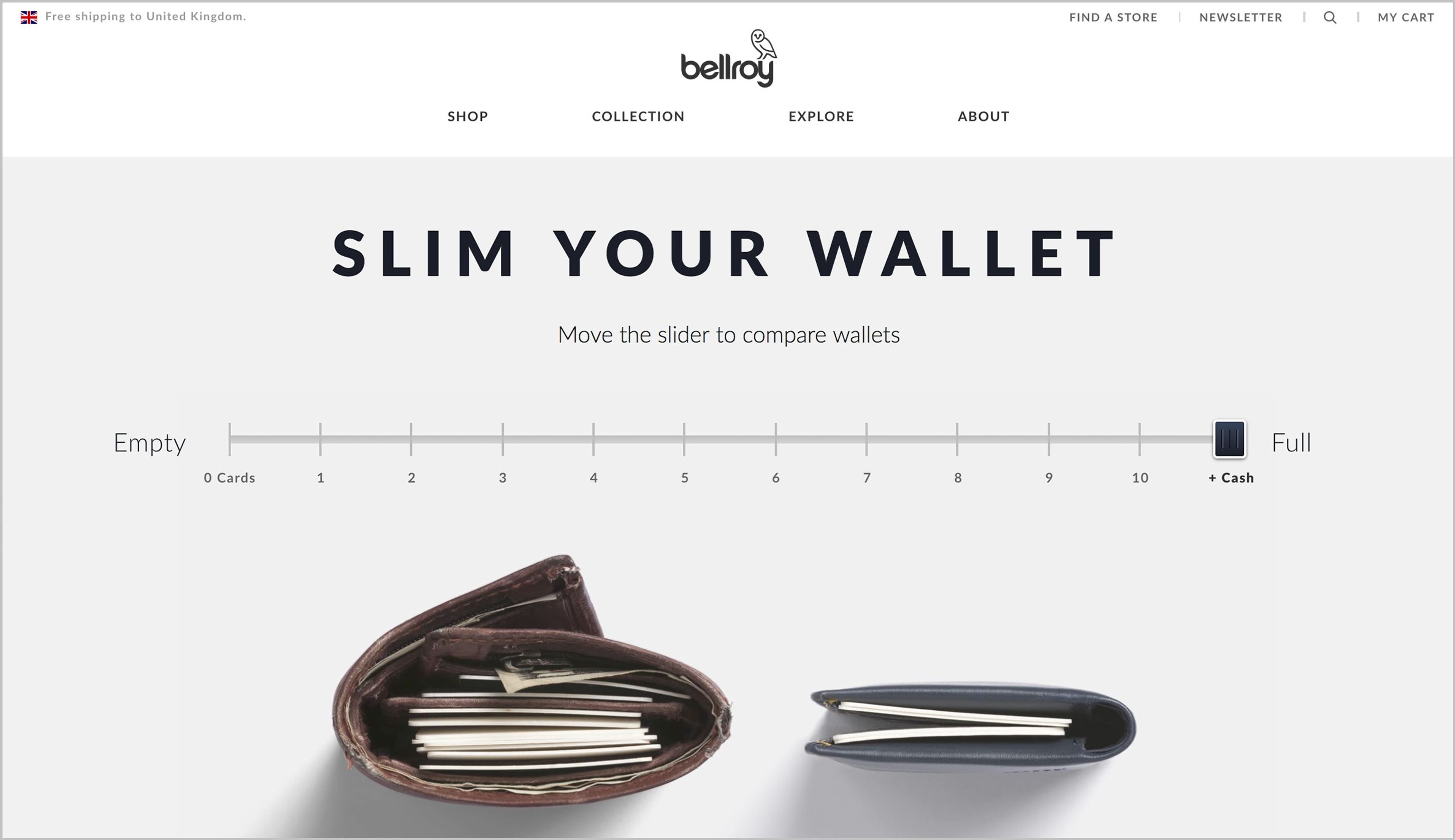
Bellroy do an excellent job of illustrating their USP with an interactive feature on their homepage. They sell slimline wallets, which is immediately portrayed with an interactive range slider.

Bellroy homepage