One of the most frustrating things as a web designer or developer is website deterioration.
Let me paint you a picture:
On launch, the site looked great. Everything is working as it should. But then, just a few months down the line you take a look at the website you put so much love and care into, and it looks awful. The site has become chaotic and messy. Its look and feel is now inconsistent and the wrong components are being used for the wrong purposes.
The fault doesn't lie in the hands of the content manager. They were simply using the tools you provided in the best way they knew how. After all, a content management system should be usable by anyone from inexperienced interns, to marketing managers.
If this all sounds painfully familiar, don't fret. We've collated a list of the main website deterioration culprits, so you can avoid the pitfalls...
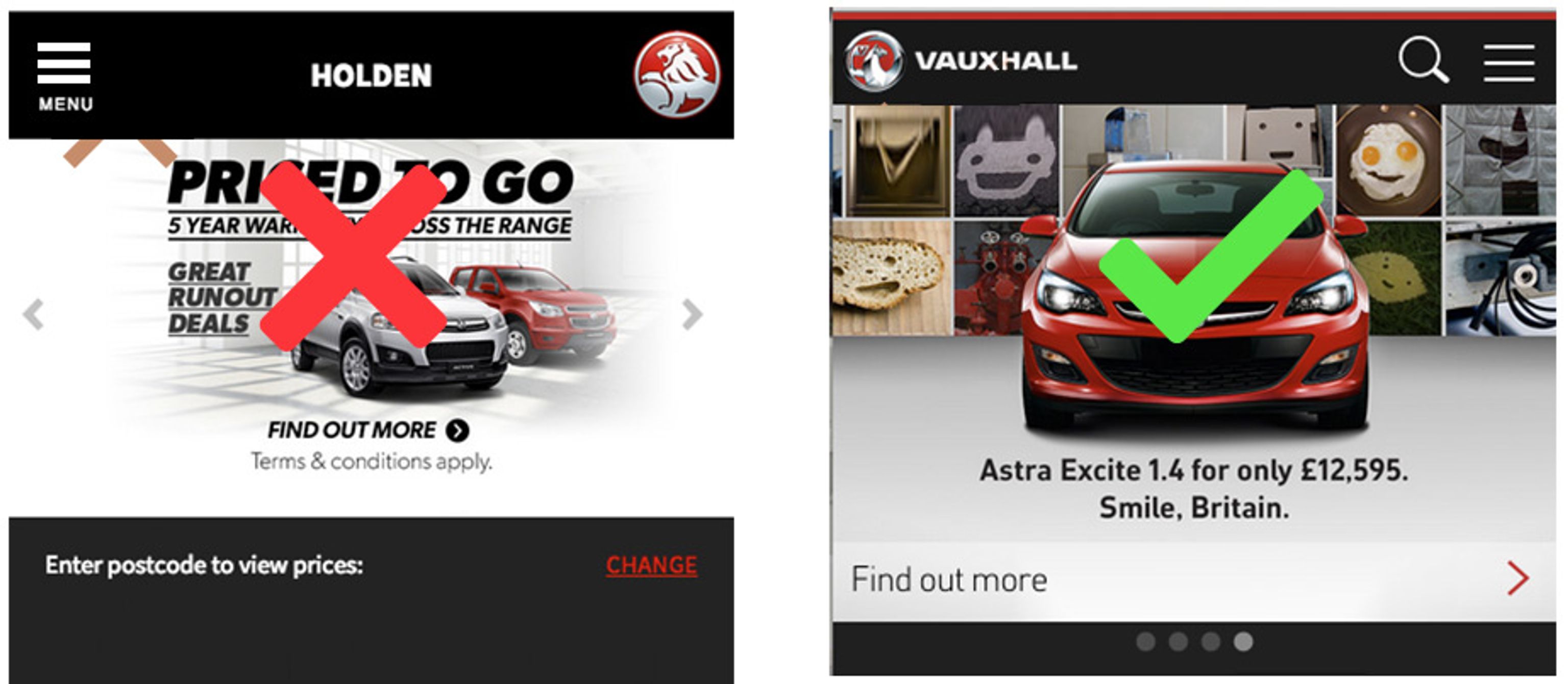
Because web designers tend not to have control over these images, it doesn’t take long before call to actions within campaigns become inconsistent, and mobile sizes are overlooked. That's why it's so important to establish rules, so that call to actions follow the same formula.

Holden vs Vauxhall mobile site 2014
To solve this at Function & Form, we make sure that the call to actions are always live text. This ensures in-house designers still get free reign over the image to portray their current campaign branding, without compromising the site's user experience.
In most cases you have multiple styles for call to actions: One primary, a secondary and maybe even a tertiary.
I always limit primary actions to one per page and they are usually reserved for starting or completing a task. Secondary actions are for referencing related content or tasks. And tertiary actions are inline body copy links.

Primary, secondary and tertiary links
Problems occur when content managers over-use primary call to actions. I’ve seen pages with 20 or so primary actions scattered across the page. All this does, is weaken their strength, confuse the user, and ultimately damage click-through rates.
To prevent this, limitations should be in place to ensure their proper usage requirements are met.
Personally, I tend to limit page depths to no more than three levels. Homepage, SEO landing/nav pages, and content pages. Clients, however, often add further levels to these content pages if the CMS allows it. This is a huge problem when it comes to keeping content organised.
By disallowing users from creating any more than two or three levels to the CMS menu, clients are then put in a position where they have to think very carefully about how they structure their content. This preserves site architecture and prevents users from getting lost or having to click too many times before they find what they're after.
If you don't specify component usage or supply an adequate range for different purposes, the content manager is more likely to use components incorrectly. This also means thinking ahead for future requirements down the line, however unattainable they may feel at present.

Content block types for City of Darwin Council website
Often, CMS developers over use the rich text editor. The thinking being that the client may like the control it gives with text styles and image placement. This is great for articles. But for everything else, 'page builder' drag and drop blocks with entry fields are better. For example, I have seen contact pages with a list of addresses that were added via the rich text editor, meaning that each address was inputted in a different style, or format causing inconsistencies. If these were components added with fixed text fields, they would always be styled in the same way.
All of these suggestions do require a little more work, but approaching a CMS in this way means you can be confident that your product will continue to be managed correctly for years to come. The client will also be very happy with such an easy to use CMS, and will most likely return for a smoother faster design refresh in the future.